
Most people who look at your work will never stand in front of it. A curator reading an open call, a gallery assistant sorting submissions, a collector scrolling on a train: every one of them meets the photograph first, and many of them only ever meet the photograph. A painting that glows in the studio and arrives on screen as a tilted, glary, yellowish rectangle has lost the argument before it started.
The good news is that photographing flat work well is not a matter of expensive equipment. It is a matter of controlling four things: geometry, light, colour and the file. Get those right with a modest camera and you will outperform most portfolios submitted with far better gear.
Geometry: square to the work, not to the room
The most common fault in artwork photography is keystoning, where the rectangle of the canvas comes out as a trapezoid because the camera was tilted up or down relative to the surface. Software can correct some of it, but every correction stretches pixels and softens the edges. It is much better to get it right in the camera.
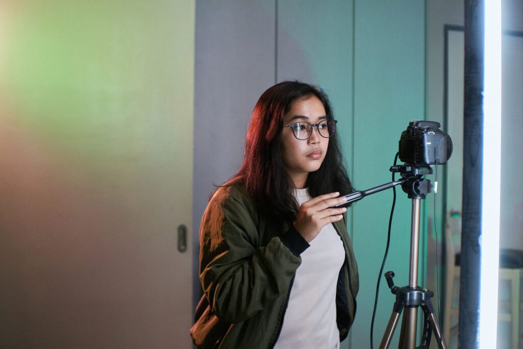
Hang or prop the work so that it is vertical, or as close as you can manage, and set the camera on a tripod with the lens centred on the middle of the piece. The back of the camera, the sensor plane, should be parallel to the surface of the artwork in both directions. A small spirit level on the hot shoe and another against the frame or stretcher will get you most of the way. Many cameras also have an electronic level in the viewfinder.
Focal length matters more than people expect. A wide-angle lens used close to the work bends straight edges and exaggerates any small misalignment. Stand further back and use a standard or short telephoto focal length, and the lines stay straight. On a phone, avoid the ultra-wide lens entirely and use the main or telephoto camera, stepping back until the work fills most of the frame with a little margin to crop.
Light: even, diffuse and from the side
Light is where most of the difference between amateur and professional documentation lives. You want the whole surface lit evenly, with no hot spot in the middle and no falloff at the corners, and you want no reflections from the surface itself.
The standard studio arrangement is two identical lights, one on each side of the work, each aimed at the artwork at roughly 45 degrees and placed at the same distance. Because light hits the surface at an angle, the specular reflection bounces away to the opposite side instead of straight back into the lens. Aim each light slightly towards the far edge of the piece rather than its centre, which helps even out the illumination across the width.
Use lights of the same type and the same colour temperature. Mixing a daylight-balanced lamp with a warm household bulb produces a colour shift from one side of the picture to the other that no single white balance setting can fix. Switch off the overhead room lights and close the curtains if daylight is changing.
If you have no lights, open shade on a bright overcast day is a respectable substitute. Direct sun is not: it is harsh, it throws the texture of the canvas into exaggerated relief and it shifts colour through the day.
Glare, varnish and glass
Glossy oils, heavy varnish and anything behind glass are harder. With glazed work the simplest answer is to photograph before framing. If that is not possible, move the lights further to the sides and check the frame from the camera position for reflections of the camera, the tripod and yourself. Wearing dark clothes and hanging a black cloth behind the camera helps more than you would think.
For persistent glare on textured or varnished surfaces, professionals use cross polarisation: polarising film over each light and a polarising filter on the lens, rotated until the reflections disappear. It costs some light and some money, but it is the reliable way to show impasto without white flecks on every ridge of paint.
Colour: give the camera a reference
Your camera does not know what white looks like under your particular lights. Tell it. Place a grey card or a colour checker target next to the work for one reference frame, then use it to set a custom white balance in the camera, or to correct the whole set later in editing. Once the lights and camera settings are fixed, do not change them between works in the same session, so that every image in the series carries the same correction.
When you edit, compare the screen with the actual work under neutral light, and be honest about the difference. A calibrated monitor helps a great deal. Resist the urge to boost saturation or contrast to make the work look more exciting than it is. A juror who later sees the real piece and finds it duller than the image remembers that.
Camera settings that matter
- Shoot RAW if your camera allows it. It keeps far more information for white balance and exposure correction than a JPEG does.
- Use the lowest native ISO for the cleanest image, and let the tripod deal with the long shutter speed that follows.
- Choose a middle aperture, often around f/8 on a full-frame or APS-C camera, where most lenses are sharpest across the frame.
- Use a self-timer or remote release so that pressing the button does not shake the camera.
- Focus carefully on the surface, and check the corners at full magnification before moving on.
Three kinds of image, not one
A useful portfolio set for each work contains more than a single straight shot.
The full view is the record: the entire work, square, evenly lit, cropped to the edges of the image area. For unframed canvases, crop exactly to the painted edge. For works on paper, decide whether you are showing the sheet or the image and be consistent across the portfolio.
A detail shows surface and scale: brushwork, paper texture, the grain of a print. Jurors often ask for one, and it is the image that persuades someone the work is worth seeing in person.
An installation or context view shows the piece on a wall, ideally with something that gives a sense of size. It should never replace the straight shot, but it answers a question the straight shot cannot.
Files, names and records
Keep a full-resolution master and export smaller versions for each use. Many open calls and application platforms specify exact pixel dimensions, file sizes and formats, and they are not flexible, so read the call before you export. Name files in a way that survives being separated from your email, for example your surname, the title and the year.
Record title, date, medium and dimensions for every image at the time you shoot it, not months later. Dimensions are conventionally given as height before width, then depth for three-dimensional work. If you are also writing about the work, the photographs and the text should agree with each other; our guide to what a portfolio needs covers the writing side.
When to pay a professional
If you are applying for a major prize, producing a catalogue or planning to make reproductions, a professional art photographer is usually worth the fee. Reproduction in particular needs a colour-managed file of a higher standard than a portfolio does, and the difference between an edition and a reproduction matters to buyers, as our piece on editions and reproductions explains. For everyday documentation of a growing body of work, though, the setup above, done carefully and done the same way every time, will produce images that let the work speak for itself.